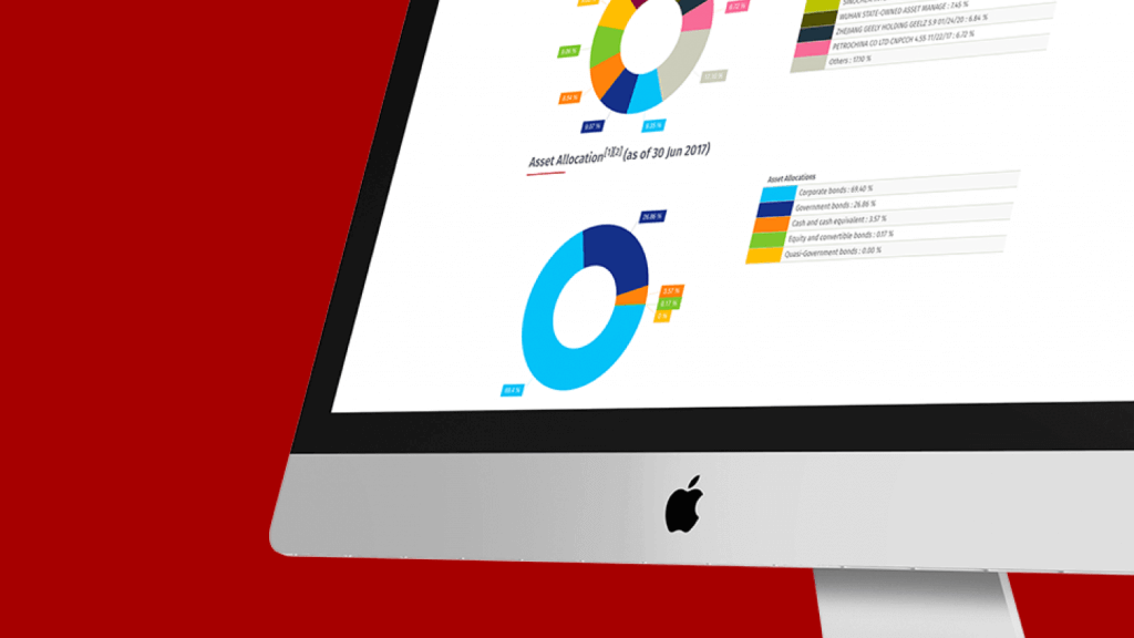
Working with Harvest Fund Management, one of China’s largest fund managers that oversees investments worth $100bn, Peregrine completely redesigned their website.
Harvest Global Investments
Objectives
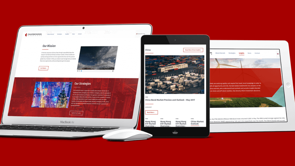
Harvest had different websites for different regions and wanted to redesign their web presence. The objective was to unite the designs, bring consistency and sophistication to them, and to include interactive performance data. The websites also needed to appeal to audiences from global markets and include Chinese versions.
Strategy
Peregrine worked with Harvest, and their development team to bring this site to life.
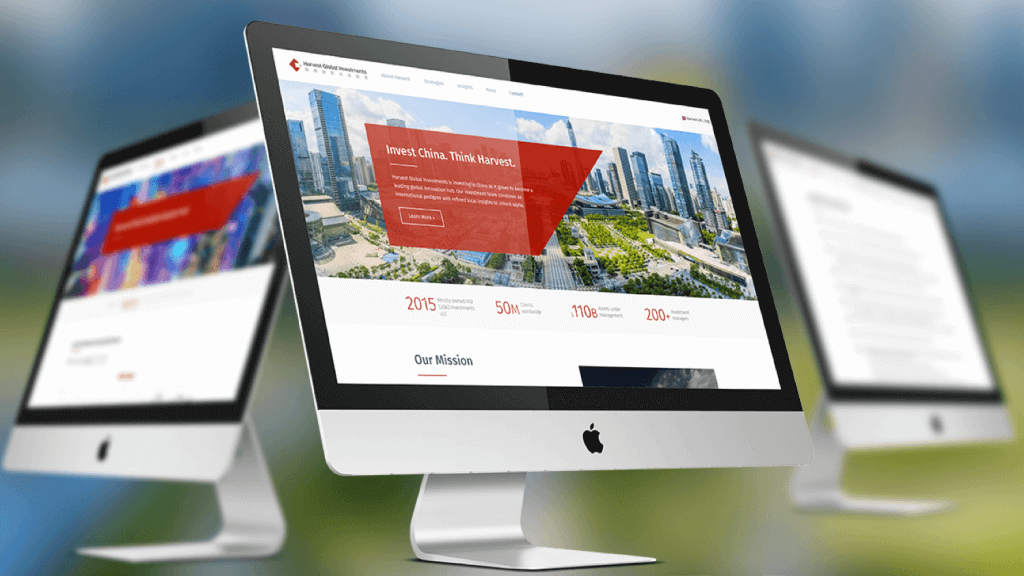
Our main thinking revolved around the slogan, "Invest China, think Harvest". We wanted to create a sophisticated destination for visitors and to highlight Harvest's legacy and expertise in the region. Legacy and Expertise are often conveyed by more traditional and old-fashioned designs. For Harvest we made the decision to make them feel modern and forward thinking.
The website uses clean and flat shapes, with hard angles and straight lines. These make the site feel ordered and uncluttered. We coupled these with Fira-Sans; a humanist font with a hint of personality.
The site makes use of large colourful photography. One of the most exciting aspects of this project was researching China and it's differing regions. Traditionally seen as an industrial and agricultural economy, the photos we were finding showed an incredibly advanced society. They featured fascinating feats of modern architecture, and entire cities which felt much more futuristic than cities we see in Europe or the US. When juxtaposed against the Chinese landscapes some of the photos were immensely powerful – it was essential that the website showcase these.
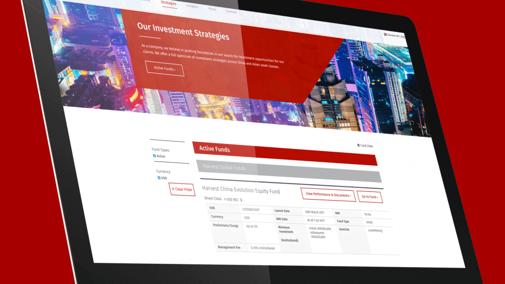
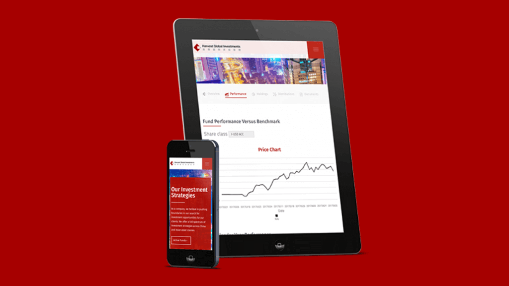
Aside from refreshing the design we also needed to include sections for interactive Fund Data.
Designing Performance Data and Fund Information sections is all about making the information easy to read. This involves working with tables, filtering system, graphs, pie charts and download sections; and ensuring that the designs and interactivity worked at all screen sizes.
Result
The new Harvest website now follows a unified brand vision. The compressed project timeline together with an ambitious scope created a challenge, but we worked closely with the Harvest team and delivered something dynamic and forward thinking which lays the foundation for Harvest's continued expansion.


