
We have a look at seven of the most common design mistakes we see in Powerpoint decks, as well as our tricks and tips to get the most out of your presentation.
Don’t forget to [thrive_2step id=’6221′]download[/thrive_2step] our freePowerPoint Checklist, which you can use to help with your next PowerPoint.
1 Alignment

It may seem like an obvious one, but many decks that come to us are improved by using the inbuilt alignment tools in Powerpoint.
Much like the design in a Scandinavian home, or a Braun record player, the careful alignment (and distribution) of objects can go a long way to instilling a feeling of serenity.
Humans respond positively to order, and a precisely aligned slide will imply a firm is operating precisely.
2 Overcrowding

The temptation is often to include as much content on a slide as possible. We get it, you’re proud of your content. But remember your audience; they will be trying to listen to you at the same time as they take in the content of your slide.
Less is more.
At best, a slide should convey one idea. But realistically you could end up with 50 slides. We recommend using three key take aways, limited to bullet points and language that is quick to digest.
We recommend using three key take aways, limited to bullet points and language that is quick to digest.
White space is not an invitation to fill it. Much like the design of an iPhone, there is strength and confidence in minimalism. Don’t be tempted to use that free space for another table, graph or an image.
3. Size
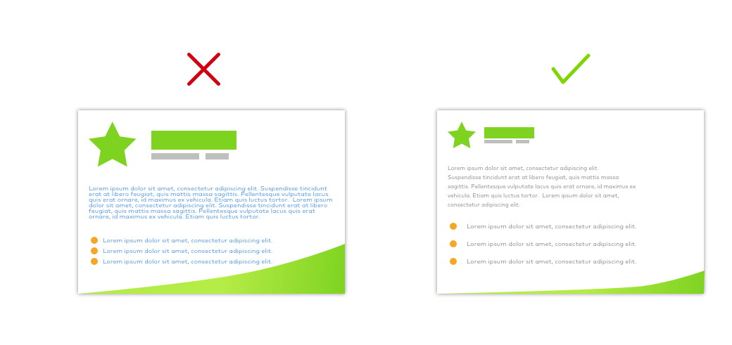
Your logo is too large. So is your font. So are those images.
One of the first steps we take is to reduce the size of the font and increase the line height. Why? A smaller font (but nothing below 10-12pt) will give the content more space to breathe. The physical space between lines of text makes it easier for the brain to process. This increased physical space creates a greater sense of calm.
According to Emil Ruder’s ‘Typography’, the optimal number of characters per line of text is considered to be between 50 – 75 (including spaces). The subconscious mind is energised when it jumps to a new line but this focus wears off over the course of a line. Keep your lines short, but not too narrow.
However there are two sides to this coin.
Often we see charts where the content is too small to be legible, or where there is no padding in tables. If the chart/table isn’t 100% necessary, then see Step 2, otherwise consider adding some space around the text to give it the space it deserves.
4 Colours

Too few colours and your slides can seem dull. Too many colours and it can be difficult to achieve balance. However, one thing is for sure, you need to use colour.
For much of Dieter Rams’ timeless designs, he stuck to greyscale, using colour very sparingly. The effect is enormously powerful, as a tiny hit of orange or yellow will draw attention to that element.
Bright colours have been proven to be connected to the release of dopamine in the brain, making people feel happier.
The total opposite is true of the highly successful Big Bang Theory, a long running TV Series which subscribes to what we refer to as Jelly Bean Theory. Bright colours have been proven to be connected to the release of dopamine in the brain, making people feel happier. Like tasty sweets, the TV Series uses the same technique to make viewers feel good as they engage.
Both techniques can be used effectively in Pitch Decks. A carefully considered colour palette of blues can be offset with an orange accent, or a very colourful (and harmonious) presentation can feel stimulating and lead to an energised audience.
5 Fonts

There are two main questions when it comes to using fonts; “Which font should I use?”, and “How many fonts should I use?”
Unfortunately, the first one is almost moot. While you’re free to use any font you want in Powerpoint, if another person viewing the Deck doesn’t have the same font as you, then Powerpoint will substitute it with whatever font it deems appropriate. Exporting your Powerpoint as a PDF will get around this, but it doesn’t solve the problem if someone in your firm has a different set of fonts.
Because of this, we highly recommend you use a system font. Those are the fonts that come packaged with Windows or Mac by default: Arial, Verdana, Calibri, Times New Roman, etc.
With regards to how many fonts you should use, always remember: three is a crowd. Stick to two fonts.
Your aim should be to promote legibility and create contrast. Combining a serif font (Times New Roman or Georgia for example) with a sans-serif (Arial, Verdana or Tahoma) is often a good combination. The contrast between the two typefaces will be an effective way of making headings stand out.
Inconsistencies can very quickly make a design look untidy.
However, there is something else to take into account. Keep your font selection, colour and size consistent throughout your document. Always use the same sizes for the main headings, and the same for the sub headings. Always use the same for all the body copy. It may sound obvious, but differences in font size, line height or colour will impact hugely on the design. Inconsistencies can very quickly make a design look untidy.
Finally, a little note on justifying. As a rule; always justify-left. To complicate matters further, Powerpoint refers to this as Align-left. Don’t confuse this with the tips in section 1.
There will be times when you need to centre-align text, that’s fine. More infrequently, items may be aligned-right, but resist at all costs the desire to justify the text. It may look neat, but is harder to read and creates uneven spacing and hyphenation.
6 Imagery
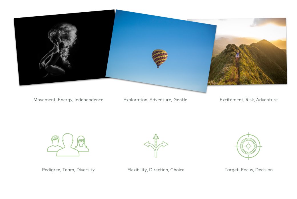
“A picture is worth a thousand words.”
When we researched our article “5 Design Trends in Financial Services to Watch in 2017”, we found that humans process visuals 60,000 times faster than text.
Whether you choose to use a photo, an icon or a graph, the evidence is clear: a visual accompaniment can drastically improve the efficacy of your slide.
We favour the mantra from section two – less is more.
Including one powerful visual on your slide can make it particularly memorable, especially a photograph.
Including one powerful visual on your slide can make it particularly memorable, especially a photograph. But the danger with using photography is two-fold; you can run the risk of using an overly staged photo, which makes a presentation feel fake; or you can inadvertently use a copyright protected image which can lead to legal difficulties.
Our advice is to steer clear of photos in favour of icons and custom illustrations. Use known resources like shutterstock, where you can download icon sets. These sets will give you a nice array of choice, while ensuring consistency. At Peregrine we create bespoke icons, as a delicately tailored icon can really enhance a text slide.
7 Consistency
Finally, and most crucially of all, be consistent.
Nothing will do greater harm to your hard work than inconsistency across slides. Here are a few things to look out for:
- Make sure your main headings are in exactly the same place on every slide.
- Ensure the margins are the same, so that body copy is always a set distance from the edges, or from the headings themselves.
- Circles should be circles, not ovals.
- Colours should be consistent; for example, always have headings in one colour throughout.
- If you use a 1pt grey line for a table with a bold font, then use the same rule for your graphs.
This can be the most time-consuming phase of designing a deck, as it involves checking and double checking. The efforts are worth it as the end result is a Powerpoint that feels uniform and robust. You can’t underestimate what your Powerpoint says about you as a firm, especially as a first impression.
Conclusion
Powerpoint is often seen a means to an end, but with patience, perseverance and experience, you can turn something which seems pedestrian into something sophisticated and engaging.
Content is king, but proper time must be dedicated to making that content shine. The common idiom about not judging a book by it’s cover may have some truth, but the reality is that we all judge based on appearance. With an increasingly sophisticated audience to impress, the need to differentiate your brand is more pivotal than ever before.
First impressions count, and we believe that taking the time to craft a stylish and distinguished deck will make a difference.
Case Study
Further Reading
- 14 PowerPoint Presentation Tips to Make Your PPT Designs More Effective
- 11 Design Tips for Beautiful Presentations