In 2019 the world of Financial Services embraced design. With the increasing need to be differentiated and set your brand apart, expect 2020 to be the year that financial services explore all the benefits that consumer-led design has to offer.
Below, we highlight 5 trends that we expect to be making inroads in 2020.
1. Motion Design
An increase in the appetite for more consumer-led design will lead to an increase in the the most eye-catching of techniques; motion graphics.
Advances in HTML and CSS mean that more complex and surprising animations can be created. In the past these needed to be built in Flash, which Steve Jobs and Apple turned their backs on. Now animation can be made fully compatible with all desktops and smartphones.
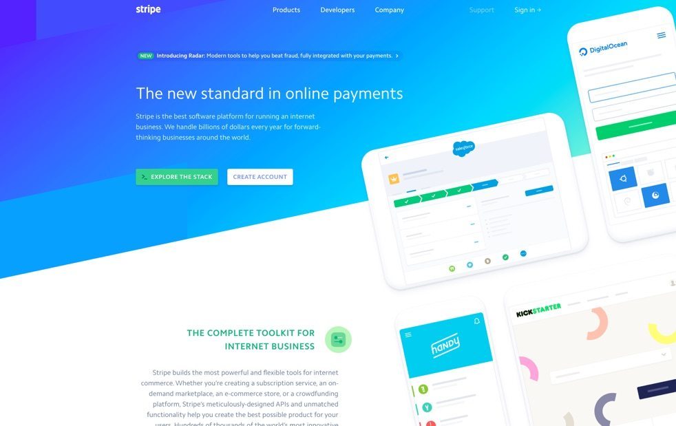
Expect that trend to find it’s way from consumer sites like Zero Financial (shown above) and Stripe, or even more adventurous approaches like Time is Money.
2. Video
2017 will be the year that we see more and more firms using video to communicate their edge. In Peregrine’s recent study of digital marketing, we found that video was far and away the most successful way of engaging audiences. Surprisingly, only 9% of companies took advantage of it.
Although creating videos is quicker than ever, what will set yours apart will be good story telling, with original and educational content.
A hugely undervalued resource, expect to see a lot more video in 2017.
3. Interactive Fund Pages

Gone are the days where your investors were satisfied with static graphs and charts. Mass adoption of smartphones has created a far more sophisticatedaudience. Users are now accustomed to apps where they can interact with the screen, zoom into graphs or tap elements to reveal further information.
Using the latest advancements in web technology we can now create graphs that are animated and fully interactive.
2017 will see more firms using these technologies to feed live data directly into their websites; therefore giving investors much more granular access to fund information.
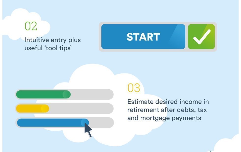
4. Process infographics

A picture is worth a thousand words. This is never truer than with an infographic. Evidence shows that users only remember 20% of what they read, and that visuals are processed a staggering 60,000x quicker than text.
Infographics have been a staple of consumer design for the past 5 years, but are now finding their way onto the shores of financial services. They are the perfect medium for conveying complex processes, and disseminating the wealth of statistics and analysis found on today’s websites.
Because of the potential to go viral (a tweet is 820% more likely to be retweeted than a traditional post), an infographic can also deliver great benefits to SEO and bolster brand recognition.
5. Colour

The last item on this list is in many ways the most adventurous.
The world of Financial Services, and more generally, corporate design, has for many years stuck to safe palettes. Brands have been using shades of blue, reds and pastel colours. The industry is now at a turning point. The need to differentiate brands and educate investors on their distinguishing qualities has never been more important.
As a result, over the past 18 months we’ve seen an increase in brands wanting to explore gradients and bold colours.
Expect to see more brands adopting the same strategies that have been working so effectively for FinTech; Wealthsimple, SquareUp, Robinhood and TransferWise


