
Print isn’t dead. Pick up a copy of Investment Week, Wealth Manager or Financial Adviser and every other page feels like it’s an ad.
Printed Ads are tactile, experiential and according to research conducted by the American Marketing Association, readers give print publication their nearly undivided attention, “rather than multitasking like they do when consuming digital content.”
So what do your Print Ads say about your firm?
Some are photography based, others are totally computer generated. Some feature lengthy copy, and others hardly have any text at all.
We’ve picked out 6 print ads to look at in further detail.
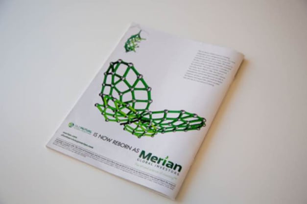
Merian (formerly Old Mutual)
Old Mutual’s rebrand to Merian has been supported by a large advertising campaign. The chances are that you have come across an ad for Merian – they’ve even gone so far as printing on large format billboards across London.
Named after a female scientist (whose likeness was once featured on a 500 Deutsche Mark banknote), Maria Sibylla Merian was known as a scientist, artist and adventurer. Merian Global Investors tell this story in their ad.
They have eschewed traditional imagery in favour of 3D rendered butterflies. The butterfly is shown to have hatched from its cocoon, floating towards the viewer. The story is very clear; a new brand has evolved out of an old one.
But what makes this ad particularly intriguing, is the design of the butterfly. A butterfly is a feminine creature, nimble and delicate, and sits in stark contrast to other animals used in Financial Services (think of the Merril Lynch bull, with its front hoof ready to charge). With their often captivating wing designs, the butterfly represents “art”.
This particular butterfly has been constructed out of DNA-like strands. These DNA strands represent “science”.
Merian are telling a story, supported neatly by their strap line; “the art and science of investing.”
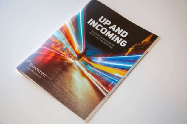
Investec
Investec have more recently been known for their zebras. This ad marks a stark change in direction for the brand.
The photograph is very powerful, the bright lights and shapes combine to hint at movement. It feels futuristic, especially when set against the traditional buildings in the background.
What makes this unusual for an ad in Financial Services publications, is the stripped back nature of it. There are no figures, no web addresses, no legal disclaimers and no additional accoutrements. This makes the main heading of “Up and Incoming” stand out even further. This ad is making a statement and wants to ensure that that isn’t lost.
Whereas Merian are telling a story, Investec are appealing to our inquisitive nature. This ad is intriguing, suggesting there is more to come and invites the viewer along for the ride.
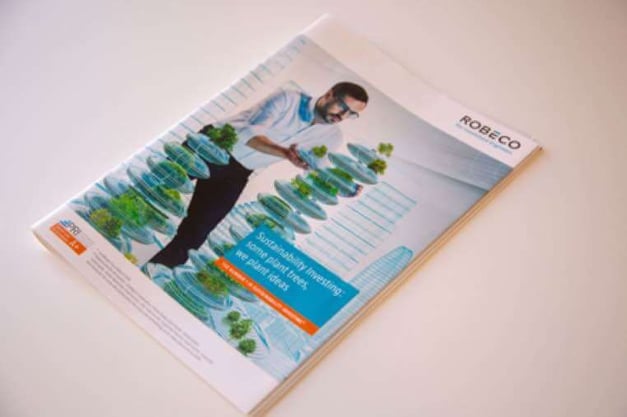
Robeco
Robeco combine the themes of Engineering and Sustainability to great effect. The imagery of the lush verdant trees growing amongst transparent wireframed buildings is superbly executed, but what makes this ad particularly successful is the inclusion of a human being.
The man looks like he’s employed by a forward-thinking firm, he doesn’t wear a tie, has removed his jacket and rolled up his sleeves. His attire is almost casual. But it’s his pose which really captivates your attention. He looks intensely concentrated as he handles the 3D pot plants with immense care.
The man is directly handling the data with his bare hands, re-enforcing the suggestion that Robeco take great care with your investments, but also that they are intimately familiar with them.
The message is also clear; sustainability investing is easy on the surface, but what Robeco achieve is far more complex.
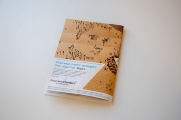
Aberdeen Standard
Aberdeen are communicating a few different themes in this full-page ad. The perspective of the photograph is a nod to being able to see the big picture, which in this case is a human face made up of lots of different people.
It’s a very arresting image, and the way it’s been constructed will likely draw in the viewer (the animated version of the ad is even more impressive)
But what is it saying?
It says that there are lots of people out there (and that Aberdeen can see them all) but the one person that matters to them is you. This is supported by the heading in the ad, “One objective. Yours”.
The language puts the power in the hand of the viewer, acknowledging that you know what you need, and no matter what that is, Aberdeen Standard have the Investment Strategy to support that.
The ad is intriguing, and the design is creative. It feels positive and inviting.
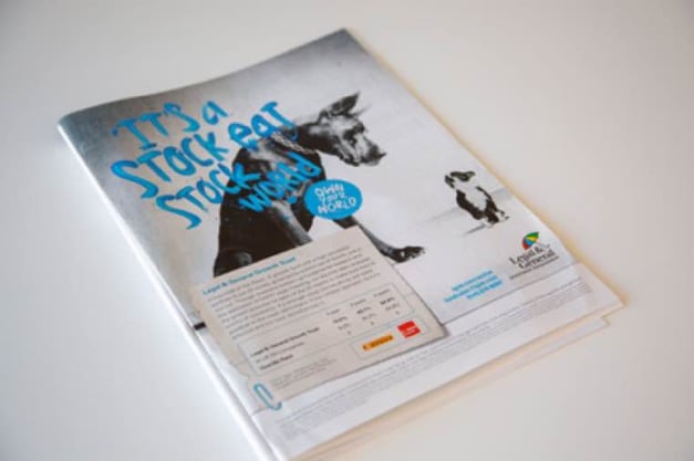
Legal & General
We’re all familiar with the Legal & General branding; a very traditional typeface, combined with the comforting shape of a colourful umbrella. Founded over 180 years ago, this brand is often viewed through a very institutional lens. This ad is a clear attempt to break from that tradition.
There is a lot to digest here, but what really stands out is the typography. It’s very unorthodox, and directly challenging the viewer. The type looks like it has been created with real paint, giving it texture and life. The combination of caps with lowercase characters, all in different sizes gives the ad an anarchic feel.
The language is fun, using a play on words to convey the message that LGIM are the big dog, and if you invest with them you can “own” your choices. It’s a very empowering concept.
To support their claim, they include a pullout box with longer text. The text is written in an almost staccato rhythm, contributing to the edgy effect. This is further re-enforced by the rough-cut effect of a piece of paper held on to the ad by a paperclip.
In a surprising move for a large institutional player, the overall effect is quite striking and very bold.
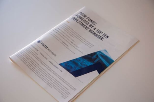
PGIM
Prudential’s Investment Management ad is the most text-heavy.
Unlike the other examples, PGIM’s ad doesn’t have a central visual concept. It relies on the existing brand equity to convince the viewer of their worth. The language is clever, “powered by a top ten manager”intentionally juxtaposes the term “powered by” (which is more commonly used by Quant firms advertising their technology) with the idea of an actual Top Ten Manager. They are indirectly suggesting that having real people behind their Funds makes them better than firms who use technology.
Visually, however, this is the most generic ad of the set; the photograph is of a generic bridge, masked within an abstract shape, overlaid with an industry-standard navy blue.
PGIM aren’t concerned with making a statement like LGIM or Investec, equally they don’t seem to be interested in telling a story like Merian. Their position is clear, they are confident in their team and want you to know it.
Conclusion
Each ad has its own merits, but what really sets some of these apart is the story they tell.
In 2009, the Guardian estimated that the average London commuter sees 130 ads per journey. And as far back as 2007, marketing firm Yankelovich, Inc. estimated that the average person sees up to 5,000 ads a day across all channels! That number can only have increased.
The chances that you’ll remember an ad you saw 24 hours ago (much less a week ago) are low. If the ad features a generic image with a generic strap line, those chances are even lower. But odds that you can remember a story are a lot higher.
The plot to your favourite movie? Fables from your childhood? Research has shown that messages delivered as stories are up to 22 times more memorable than just facts. Stories engage our emotions and make us use our brains differently.
At Peregrine we help our clients tell stories to keep audiences invested. But a good story isn’t enough, you need to combine it with memorable visuals and deliver it via the right channels.
Peregrine. Story Telling For Business Results.