PVE Capital, an alternative investment manager, approached us in the summer of 2016 to deliver a total rebrand.
Their existing branding was solid, they had a website which made use of professionally taken colour photos of the neighbouring streets around their Mayfair offices and an institutional logo, as well as using “yellow” as their primary colour.
Working in the credit market space made it clear that PVE had a unique approach to investing, and that aside from using yellow, their differentiated approach wasn’t reflected in their branding.
Our aim was to work with PVE to create a unique brand expression. We wanted to create something which showcased the PVE difference, and made them stand out from the pack.
PVE Capital
Objectives
Our main goal was to redefine the PVE brand, and deliver a set of robust and scalable guidelines on how to implement the brand going forward. This also included a full website redesign and branding collateral. The consistency from one aspect of a brand to another is paramount, and we needed to ensure this continuity.
Strategy
We began by spending time with the PVE team to discuss their mission and their philosophy. During these conversations we also delved into the background of Gennaro Pucci, CIO & Founder of PVE. By taking the time to understand what drove Gennaro and his team we were able to build up a very complete picture.
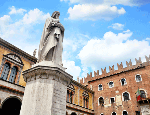
As our Communications team worked on diluting these meetings into the key messages for the brand, the Design team identified 4 key areas of research; Sophistication, Technology, Yellow & Renaissance.
We explored various directions within the confines of these themes, from the design of olive oil bottles, to the use of the hexagon’s in technology, to countless photographs and diagrams of renaissance architecture. Where these 4 themes intersect was the PVE brand.
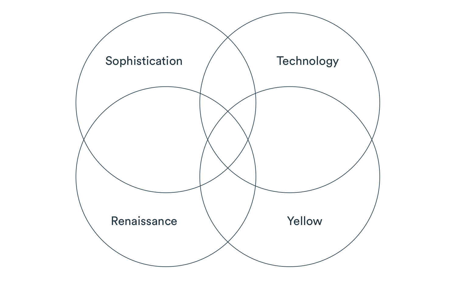
By identifying these pillars we had found a robust framework which allowed us to explore any design, always confident in the knowledge that they would be true to the PVE brand.
Result
The final result is a logo which resonates with the existing PVE audience, yet feels modern and progressive.
![]()
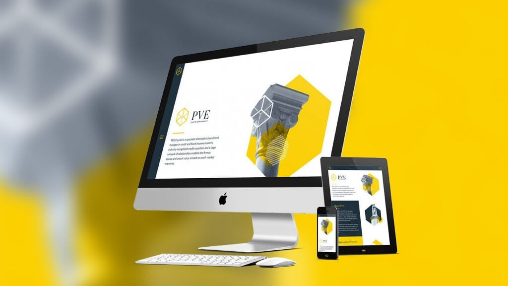
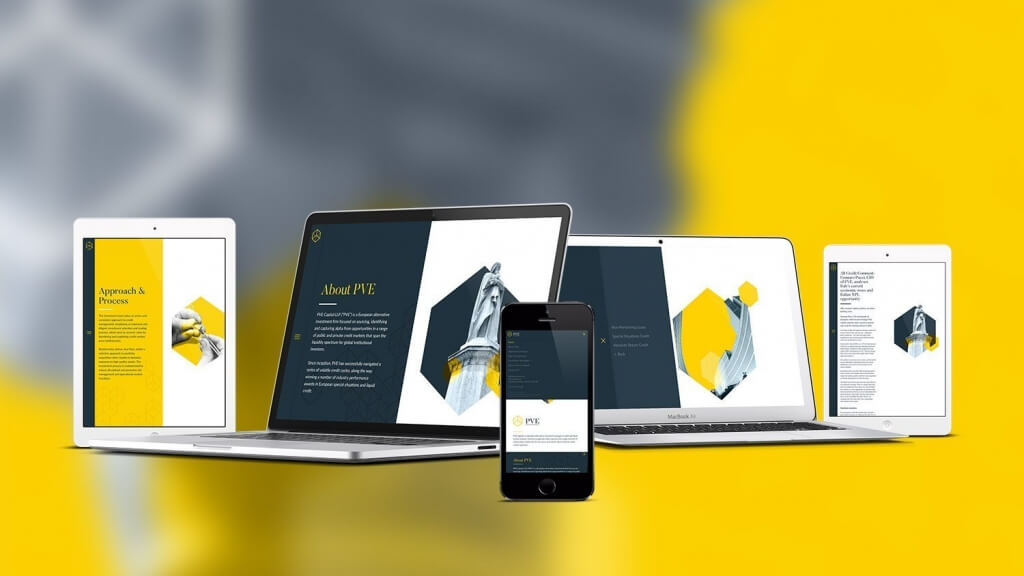
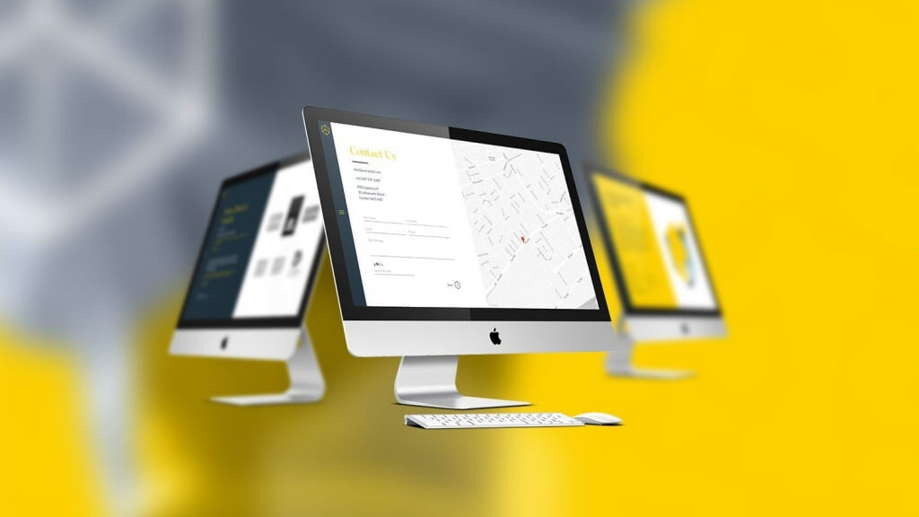
We were able to apply this to the website design where we delivered one of our most unique websites to date. It was important that the interactions and behaviour of the website reflect the individuality we encountered when we first went in to meet Gennaro and his team.
This was achieved in 3 different ways:
- Navigation
- Image Treatment
- Messaging
When first landing on the PVE website, the user is presented with what appears to be a conventional (although minimalist) website. Only upon scrolling will the unusual behaviour reveal itself – as the user scrolls down, one half of the screen moves independently to the other. This behaviour is intended to convey PVE’s alternative approach.
Click to view animation of the PVE Website scrolling effect
Peregrine also created bespoke image treatments, which combine classical objects such as pillars, statues and buildings with the contemporary angular stylings of the PVE branding. They work together to create engaging shapes with added depth.
Finally, the website contains very specific messages. Peregrine’s Content Marketing Report identified that the top 3 most used terms on websites were “Global”, “Long-term” and “Innovative”, making it essential that a company like PVE use differentiated language. This benefits them from a prospective investor point of view, but also, crucially, from an SEO angle.