Investors and prospects interact with brands through an ever-growing number of touchpoints, including websites, social networks, video and advertisements. Keeping a brand identity visually consistent throughout those channels might sound obvious, yet it is something that many companies overlook.
“The best and most successful brands are completely coherent. Every aspect of what they are and what they do reinforces everything else”.
Wally Ollins
Why is consistency important? Your brand is your platform to connect with your clients; using it inconsistently will make it harder to recognise, less trustworthy and ultimately damage your business. According to the “Impact of Brand Consistency” report, over 70% of companies believe that inconsistent brand usage creates confusion in the market. If customers remember and recognise a brand, they will feel much more comfortable engaging and investing.
This article will explore how you can ensure visual consistency in 5 essential steps. You should take them into consideration when designing your website, marketing materials, social media assets, and anything else your prospects and clients see.
1.Use your logo consistently

Your logo is the most valuable asset of your brand identity, and it should be treated accordingly. It is surprising how using the wrong colours for a logo can completely change the viewer’s perception.
A squashed logo is very noticeable and screams “bad brand management”.
Due to the nature of every platform, it is important that a logo is flexible enough to be displayed in different sizes and formats. This can range from a 2 metre printed banner to a 20 pixel square image.
Whatever the size of the logo, the proportions must always remain consistent. A squashed logo is very noticeable and screams “bad brand management”.
Google is a great example of brand scalability and in keeping an identity recognisable across platforms.
But a brand is more than a logo, and there are some other elements to keep in mind to ensure visual consistency.
2.Uniform typography

Using text is a brand’s most common form of communication. Crafting the way that text is displayed is almost as important as the words themselves. Apple can testify that a font consistently used can become as recognisable as the brand itself.
Always use the same set of fonts for your marketing materials, and a limited amount of font sizes and weights. If your company branding uses a purchased/personalised font, make sure it is installed in every computer where it will be necessary — computers where branded documents will be produced.
Whenever your font cannot be displayed (emails are the most prominent example), always have the same system font replacing it. Choosing a font compatible for PC and Mac is essential.
3.Standardised colour palette

Colour can be a very powerful element to differentiate your brand identity, but in order to create that differentiation you need to use it in a consistent manner, while considering your main competitors.
Think of Coca-Cola. It’s pretty easy to guess which colour came to your mind first. This kind of colour ownership can only be achieved through meticulous consistency.
In financial services especially, there is still a reluctance to use colours that don’t follow the industry’s standards. On that note, very few financial businesses in the UK and United States use red as an accent colour, as it can be related to indebtedness. In China, however, the same colour is associated with good fortune.
If your competitors are using dark blue, colour strategy will help you to differentiate your business. It will create an impact in your audience, and they will remember it if it’s used coherently. Here is some previous work we’ve done that illustrates that process of differentiation.
4.Branded image style

Overall predictions point to an ever-increasing value of visual content in a company’s marketing strategy. As we mentioned in the article “5 Design Trends in Financial Services to Watch in 2017”, people process visuals 60,000 times quicker than words. YouTube and Instagram are two of the biggest Internet traffic drivers, with images and video becoming more and more prominent in the content we skim through.
We have noticed in the past several companies using the same stock image of a London skyline. Differentiating one company from the rest becomes a hard task.
This is why a branded image style is so relevant. With an increasing number of firms using the same media, you need to create a distinctive voice that makes your brand recognisable. As an example, we have noticed in the past several companies using the same stock image of a London skyline. Differentiating one company from the rest becomes a hard task.
It’s important that your images look as if they belong to the same family. Aspects like the overall theme, the type of shot (i.e. front view, detail macro, aerial shot, etc.) and colour tones that harmonize with your brand’s colour palette are all important to create the idea of consistency. A standardised filter is also a good technique to add that extra amount of differentiation.
Have a look through this article to explore further how to make your image library more unique.
5.Brand guidelines and brand champions

More important than defining all the above, is the need to compile them in a document that is easy to access and understand.
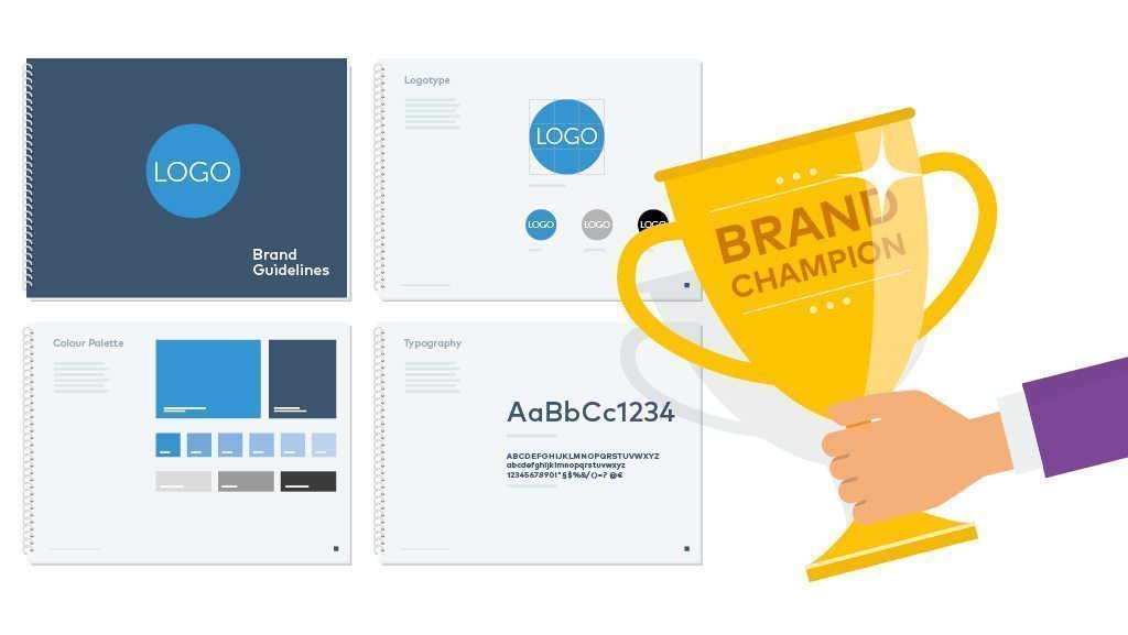
The brand guidelines should convey the style and tone of your company, and clearly describe how to use the brand identity. Here are a few examples of what this looks like.
Branded document templates also help streamline the process of creating new materials greatly. A letterhead or a presentation example will reduce brand errors and narrow the margin of brand deviation.
In itself, a brand book doesn’t guarantee that rules will be followed. Guidelines need to be enforced by one or more brand guardians. A brand guardian is someone who needs to be fully aware of what the brand stands for and check if it is being applied correctly. He or she should also try to educate staff about the importance of being consistent.
Conclusion
A consistent visual identity is one of the core pillars to an engaging and memorable brand experience. Without it, your brand won’t be dependable or trusted, and your audience will lose track of how you are trying to differentiate your business from your competitors.
That being said, consistency shouldn’t be the end of the process: every brand identity should be revisited at least every 5 years, and websites every 2 years. That will prevent the brand from standing still. To paraphrase the brand royalty Wally Olins (1930-2014), it is about adding subtle changes to make your brand stay in the same place.


